Optical Size And Variable Fonts
Choosing a font is always a problem of size. Sure, you want to pick a serif or a fancy geometric sans—the style is important—but what’s the size of the text? There’s an enormous difference between 14px and 200px and likewise you can’t pick a typeface for a billboard and a tiny book and expect them to both look just fine. You have to optimize for one size or another.
Here’s an example: Warbler Display vs. Warbler Text. You can see below that at the same size, the Display version is nigh-on unreadable when compared to Text.
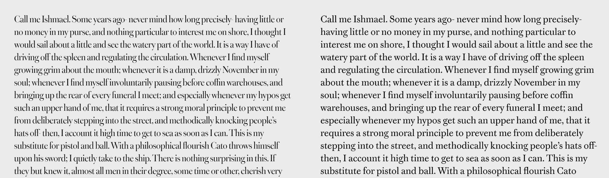
It’s so thin and fragile! My eyes refuse to read it at that size. But at larger sizes, the opposite is true. All those fine details of Warbler Display that are lost become visible and crisp whereas Warbler Text (on the right) now feels too thick and clunky at this size...
Why? Typefaces have to be designed for a certain size or a range of sizes. So, in the past, whenever you’re setting text, you’d need to be careful picking the right font depending on whatever it was that you were designing. That’s why so many type families will have micro, text, book, display, and banner variants.
It sure gets complicated, but having this flexibility is dead useful.
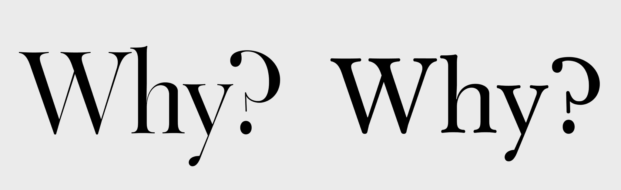
Yet now with variable fonts we don’t have to worry about that sort of thing so much because of optical sizing. This is a setting contained within some fonts that determines how it should look at certain sizes: the thickness of the strokes, the width of each glyph, basically everything about a font could change depending on the font size, all in an attempt to make the text read well across all those different environments, from small to large.
Below you can see that I’ve selected a variable font version of Output in Figma:
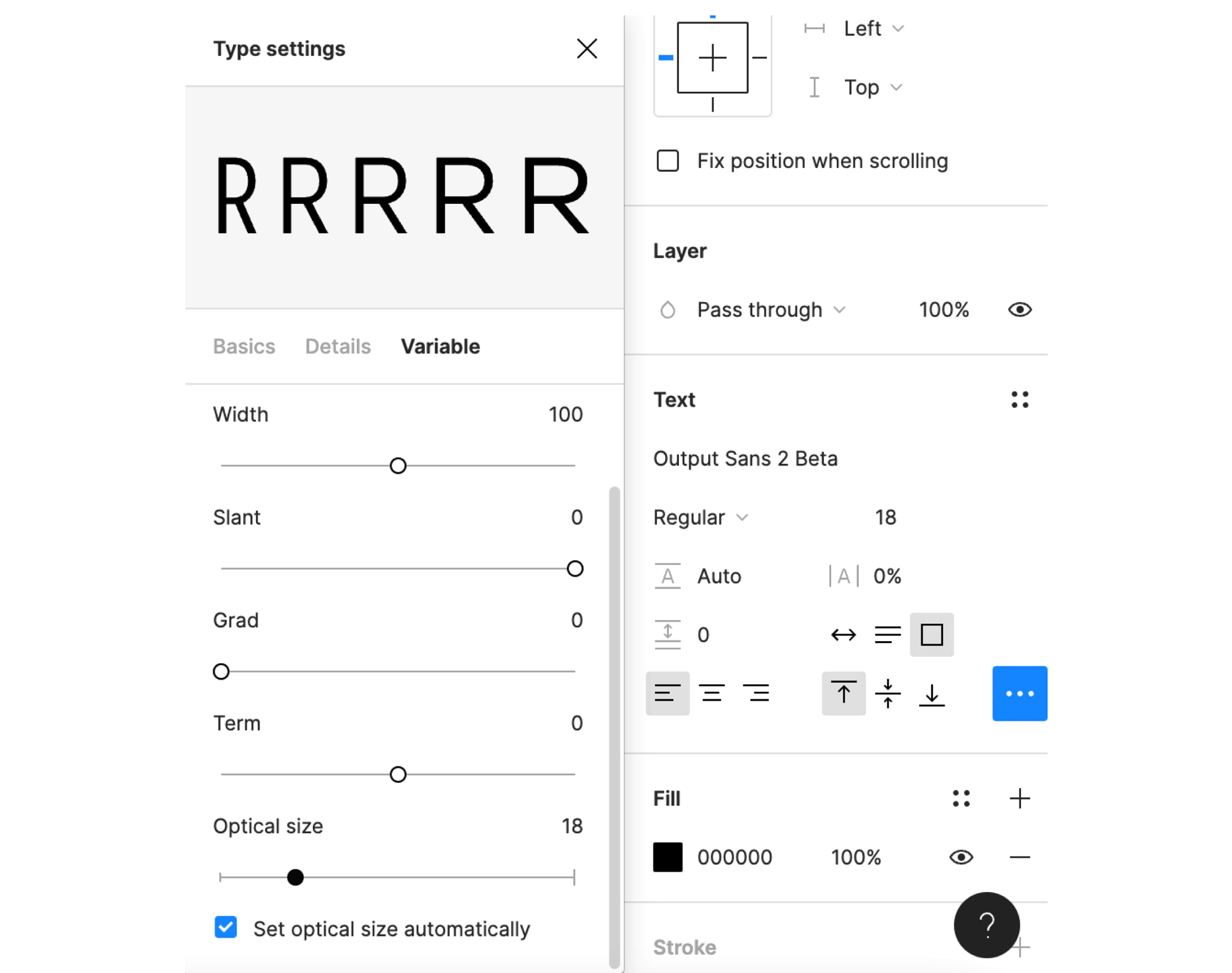
...see how in the variable submenu that 'Set optical size automatically' is on? What that means is that when I change the font-size then a number of properties will change to make the text more readable. You can see this best though when you turn it off and manually change the optical size axis:
At larger sizes the text will tighten up, getting rid of excess white space. At small sizes, everything stretches out to make it easier to discern one character from another. Now, optical size isn’t something I’ve ever messed with before. But I’ve always felt that it should be automatic (just as Figma does it today) and I don’t think this was ever possible before variable fonts (but I could be wrong there). It’s pretty darn neat.
So optical size is this lovely additional, hidden feature that likely most people won’t even know is enabled for their variable fonts but — what if optical size could be used to switch between Display/Text versions of a typeface? I’m also sure this is not the first time someone’s thought of that but whenever do I want to use a text face at 80pt? I feel like optical size should kinda be the magic default of a typeface, giving you guidance and correcting things (for example switching between micro, text, display, banner versions without you even toggling that axes on).
Then, if I wanted to, a variable font could let me customize everything. But I kinda like seeing optical sizing as a passive aggressive default—or recommendation system. Optical sizing could say: “We Highly Recommend You Turn These Features On, Sir.” And I’m sure there’s dozens of reasons why that’s not the case today but—but—what if variable fonts could take a guess at what you wanted based on the environment you’re typesetting in (like font-size or maybe even line-height or anything else)?
What if?