
A Visual Lexicon
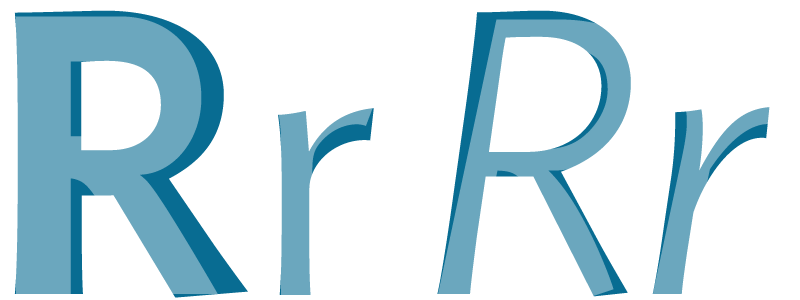
First you notice the letter. It’s squiggly and mushy on one end; a swoop joins a curl and then finds a sudden, jagged edge. Perhaps the letter you noticed was an R, or a J, or a Q but over time you’ve forgotten. All you remember is tracing its outline without hesitation. It might have jumped off the page of your book or the corner of your screen but since then the quirks between all sorts of faces have revealed themselves. Sans-serif and serif. Condensed and regular. Your eyes begin to spot the polished uniforms of finely cut serifs, or the drooping spontaneity of type that looks like flowering vines from a garden. But you’re unable to resist these letters and their love handles, though you try to control your most perverted thoughts about them.
The alphabetic comrades that accompany these letters are all different as well; you begin to see the system beneath the aesthetics and your mind reels at all that energy it must have taken to organise such a lively set of moving parts.

To reveal the whole system though, a true typomaniac will often bring similar alphabets and faces together side by side. This trains the eye to detect the inner secrets and methods, the logic that went into the construction. Shapes become blotches of negative space, as if the alphabet was carved out of marble, and since then, the first letter, that Colossus that swooped up your attention in the first place, he too, now looks regular and uniform — almost obvious in hindsight.

Seeing the smallest details
FF Meta by FontFont and Ideal Sans by H & FJYou learn how the smallest decisions can have surprising implications on the rest of the alphabet. An a is an a is an a except that you can now describe the various differences between them. X-height, contrast, descenders, terminals and stroke width become the trusted words in your vocabulary and so all of your friends now think you’ve become terribly smart. This leads to books, articles, even real life discussions where you debate the time and location in which that particular alphabet was designed.
You read the names of type designers and typographers hidden in countless rows and fields of metadata (but you want the originals, not the remixes). Yet when you try to connect their relationships with one another you find that there are simply too many of them. If an entire life was devoted to the work of Moris Fuller Benton, his typefaces would still somehow manage to creep up from their gloomy hiding places for so many decades after.
Through centuries of public scrutiny the field of type design developed an enormous vocabulary of terms which, of course, you’ve since adopted. However, rather than frightening you off with that seemingly endless list of terminologies and complex hierarchical structures, the vocabulary has only increased the pleasure – you want to learn every class, every specification, every phrase in the typographic lexicon because you believe these words will help you see. They will help you focus. They will give you superpowers.
- Serif
- Sans-serif
- Slab serif
- Humanist
- Neo-humanist
- Transitional
- Grotesque
- Geometric
- Venetian
- Stencil
- Geralde
- Modern
- Display
- Text
- Dot
- Script
- Uncial
- Monospaced
- Round
- Proportional
- Didone
Through this vocabulary typographers and designers learned how to communicate their hopes, their dreams and aspirations. They pushed back against certain trends or held dearly onto a particular style. In this way the vocabulary enabled them to argue or bicker and as you’ve joined their ranks you can glimpse at how these words empowered them over time.
In contrast, the same cannot be said for the web. Our vocabulary seems horrifically stunted in comparison, just try to jot down the popular words and phrases that our industry recruits from day to day and look at them for a moment. It’s a depressing exercise, isn’t it? When we discuss this structure of the web – specifically the visual systems made up of CSS – how do developers and designers describe the various components within? How do we name these things and how can members of a team truly see these systems if they cannot communicate effectively?
If we look at other fields, such as interface design on the iOS platform, then we can begin to see how a limited vocabulary can blind us. The debate between flat design and skeuomorphism is just one such example of interest.
Although, what’s funny about this debate is that it’s been going on for hundreds of years. It wasn’t a revolution that originated in Silicon Valley and it wasn’t the direct result of German minimalism or simplicity. Aside from this oversight, what terrifies me the most about these words is that they’re so definitive. If we choose to limit our vocabulary to these two concepts alone then we artificially set blinders around all of the other possibilities in between.
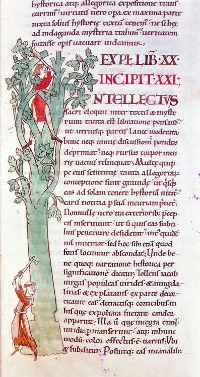
Skeuomorphism in the middle ages
A lone monk carves a capital letter ‘I’ from the branches of a tree whilst the monk below prefers his margins without such frills. Dijon, Bibliothéque municipale, 1111 a.d. – via Charlie LoydFrom margins to proton packs
By looking at the words that other fields employ we can begin to notice how design (and specifically constructing large visual systems for the web) is lagging behind in this regard. And I’ve been thinking about this for a long time, wondering how our use of language impedes our vision, how our language obfuscates our ability to engineer complex front-end systems for the web. So it’s become a source of obsession for me now, but I continuously draw lines between this extract by Tim Brown and our various communication problems:
Designing for the web is like visualizing a tesseract. We build experiences by manipulating their shadows.
That uncomfortable sensation of ‘manipulating shadows’ is one which I’ve been unable to shake for quite some time now. If you’ve spent more than a few minutes in a browser trying to figure out how the cascade works or even filling out a form then you’ve probably sensed that feeling too. With those countless bugs that creep up through testing, the rising and unforeseeable technical issues that appear from seemingly nowhere; web design shares many attributes with shadows, ghosts and apparitions. As such, web design can hardly be described as engineering, a more suitable term might be ghostbusting instead.
The ‘visualizing’ part of Tim’s description in the extract above sure is interesting though. How many times has a visual feature (such as a button or list style, a typographic detail or a gradient) rendered beautifully on a desktop browser but has become unusable on a mobile device? You might argue that this is simply because a developer couldn’t see both devices at the same time. You might argue that the solution then would be brighter, shinier tools. Applications such as Ghostlab and Duo, whereby developers and designers can visualize these problems across the vast spectrum of available devices, let us see our complex visual systems at work and it’s impossible to argue to the contrary.
Yet “visualizing a tesseract” is an incorrect summary of the problem in some ways. Instead I believe that designing for the web is more like describing a tesseract. Then detailing another that’s slightly unrelated, and yet another, and then another again (this one being unalike in situations X and Y but not in Z). These half baked descriptions of components, such as text fields, forms, buttons and grid systems, pass amongst the members of a team like a game of telephone until half way through the project we begin to find that, instead of a well documented, modular system, all we’re left with is a bucket full of useless tesseracts.
The designers, developers and project managers soon possess nothing more than the vaguest idea as to how each component works and how they can be modified for future use. Our naming conventions for these modules then tumble into abstraction or become too strict to be utilised for any other purpose. Obviously these problems have enormous implications on efficiency in the long run but can even bounce off into the real world, strengthening those negative bonds between individual team members.
Constants and variables
During the course of a recent project I noticed how our team had forked into two separate camps. It felt as if developers were working on creating a maintainable, future-proof system and the designers were pulling us in the opposite direction. Whenever we received a handover with adjustments or full-blown redesigns of a component our developers would noticeably twitch with questions. But these weren’t technical issues, mind you.
I’d often receive a series of mockups with a short description alongside a picture of a component – perhaps with variations as to how it would look at assorted stages in our grid system, or maybe how it would work on a specific template. Yet developers obviously need so much more information about a component than what a static, lifeless image can provide us. For example:
- Under what circumstances must this new component (whether it’s a button, form, logo, type setting, whatever), look like this picture? This is the idealised version of what this component does; it’s a naive, Utopian snapshot of the design.
- Does this component have modifiers? Say a different color, an alternative shape or a background that an editor might change?
- And of course, most importantly: what is the name of this thing and what does it do?
Most of the time designers can’t answer these questions at this stage in the process. They’ve worked on one component but have yet to fully grasp the extent of such a large and complex system. Adjustments to the design, and consequently refactoring the codebase, is inevitable then in the early stages. Likewise it would be utter madness for designers to create mockups of every browser rendering, every possible user condition that this information might be filtered through and experienced by. Nevertheless, I felt that our visual and technical systems were colliding with one another, making an awful lot of mess, and I believe that the source of this trouble was with how we named those components.
The dreaded alt
Let’s take, for example, a developer that wants to add a new modifier to this project. The designer has handed over a picture of a listing style and so the developer must name this new thing. What should they do? Well, the first rule is probably to stick with the pre-existing conventions of the front-end system. In this case they ought to use the Block Element Modifier syntax that we had all agreed upon in the early stages of development. But the BEM formatting rules can sometimes lead to class names such as this in our CSS:
What does an alt do in this situation? Surely the developer could have plenty of comments here to describe their motives but it doesn’t avoid the fact that this is a terrible name for a component. If the alt only changes the color then we probably should have specifically added ‘color’ and ‘red’ or ‘blue’ into the class name itself. If it’s a geometric modifier then we should have used ‘shape’ and ‘square’ instead. Or, if alt does more than one thing then we should break it apart and use multiple modifiers to increase the flexibility of this system overall.
Maintaining CSS components
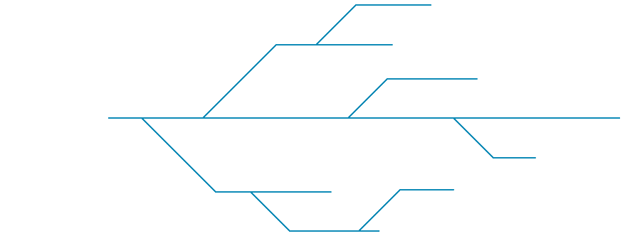
In a talk called Normalising designs for better quality CSS, Harry Roberts used this diagram to explain how a component becomes unmaintainable as more adjustments are made to it over time.Earlier in the year this was the problem that compelled me to look at how we describe modules in our CSS. I had originally assumed that a bloated codebase was the developer’s fault, or rather my own, and that I should be more responsible for maintenance, flexibility, and for the growth of the system in unexpected ways. I assumed that the problem was the lack of frameworks and rules that developers had shared amongst each other. But I was wrong.
Thanks to the size of this project – combined with the stress of multiple teams and a mobile-first workflow – it became clear that communication had broken down. I’m paraphrasing of course, but sometimes our internal discussions went along the lines of this:
“Widget two, yeah..that one..type two…”
“Uh, which one?”
“Yeah, this one right here. This should have 10px padding on that page. And this type of thing ought to have rounded corners of four pixels but only when…”
Wait – what do you mean this thing? Surely it must have a name! This component serves a unique purpose, especially since our modular, component based system in Sass is entirely dependent upon some kind of naming convention. We have a buttons.scss module that styles the buttons and our various list styles are contained within the lists.scss file. Any change to these defaults and we have to create modifiers which then, of course, must be named.
It was impossible to blame the designer in this situation, as it was my own fault to begin with. I’d been handed a picture, turned it into a component with an absurdly opaque description and never told the design team about it. So the conversations between our teams began to fall into endlessly repeating loops with problems that should have been identified much sooner. This sort of discussion took place dozens of times unnecessarily:
“Should all gamma-sized buttons have a font-size of 17px at large screen sizes?”
“Huh?”
In this instance the designer couldn’t see how flexible the codebase was and the developer hadn’t adequately described how we created these buttons along with the various relationships between our alpha, beta and gamma naming conventions. In other examples there was confusion over how we dealt with padding and margins, borders and background colors – simply because we had kept things DRY on the development side, but hadn’t discussed these solutions with the rest of the design team.
There are only two hard things in computer science: cache invalidation and naming things.
Our problems can’t be solved by more frequent handovers or highly documented and refined mockups then. Neither detailed code reviews or designers learning how to code will help much in this regard either. But these sorts of problems only seem to reveal themselves in large, responsive projects with multiple developers, designers and share holders all tugging in different directions, all trying to make the project their thing instead of our thing.
They only appear when our language is forked.

Language is a burden that ought to be shared
Bernard Blackmantle, The English Spy : An Original Work, Characteristic, Satirical, and Humorous, comprising Scenes and Sketches in every Rank of Society, being Portraits of the Illustrious, Eminent, Eccentric and Notorious, with illustrations by Robert Cruikshank. 1825 Source.This barrier between design and development wasn’t caused by a developer having superior technical literacy, or because a designer had a greater sensitivity to color, shape, or form. In fact, it had everything to do with our vocabulary. So we couldn’t communicate with one another because we hadn’t established a common ground. The designers were too busy mocking up new components and worrying about UX to understand how all of the various jigsaw pieces could be combined. Whilst developers on the other hand were too busy writing mixins and focusing on performance issues to really scrutinise each design document and wireframe.
This problem bled into every facet of the project; it led to modules being thrown out of the internal review process multiple times unnecessarily, it led to rampant frustration within the team and components having to be refactored before we understood just how flexible some of these styled objects needed to be.
The semantic handover
Many continue to revive the now tired and worn out question of asking whether designers, writers, journalists or project managers ought to learn how to code. But is it not incredibly inefficient for everyone on a project to learn every minute detail of the codebase?
In reality those key members of the team only need to see the effects of adding or subtracting code from the system. Designers don’t need to parse every intricate detail of SVG animations but they ought to understand the effects of adding a new font-size or a new color. In other words they ought to be sharing the same vocabulary as developers and clients during this process.
All of the problems I mentioned (as well as all those affiliated with responsive design in general) suggest to me that we need living, breathing descriptions of these components in order to help us clarify their objectives; what they do, how they work and why they fit into the rest of this complex system. In this way it could be said that we need visual dictionaries, the likes of which Dr Samuel Johnson would be proud.

Dr Samuel Johnson (1709–1784)
Published ‘A Dictionary of the English Language’ in 1755When a designer greets a front-end developer with a new component they should be able to point into this system, give the module a name and the variables that can be changed, documenting the various differences between this thing and that thing along the way. This is because design isn’t primarily about aesthetics (especially on the web). Design is about what things mean. It’s about how these components relate to one another and unfortunately those static mockups just don’t cut it anymore.
I believe that the solution is made up of a variety of tools that encourage conversation and improve our shared lexicon. Tools such as styleguides, pattern libraries, elemental and modular systems that encourage access not only by developers, but by designers, shareholders and editors as well. We need visual interfaces, like this fantastic pattern library by Mailchimp, to help us create better front-end interfaces that are more flexible and maintainable in the long run.
These libraries ought to be generated automatically and they should remind developers to document almost everything that they write. These libraries (accessible via a URL and not bundled into an Adobe app) should help us name other modules too. I believe that this means the team even ought to implement these components into the styleguide before anything touches the local dev environment.
Tools such as Kalei, Sassdown and Pattern Lab only hint at the various possibilities afforded to us by these tools. Regardless of their delightful utility however, these apps and interfaces are entirely useless if we stick to the status quo and bumble on as we have – ignoring these semantic and communication problems at the very heart of our work.
We’re not encoding our designs into zeroes and ones.
We’re abstracting these visual components into language.
I believe we ought to consider how these errors have been rooted not in tools or workflows, not in browser bugs or frameworks. Instead they are intertwined with our ancient, almost pre-historic issues with reading and writing. But due to the explosive growth of these responsive, modular systems, we now require new words with which to see.
My only hope is that we find better ways to share them.